Mobile incompatibility is a significant concern for corporate websites today. A user-friendly experience is paramount in today’s digital landscape, and mobile-friendliness is no longer a luxury—it’s an expectation. Failing to ensure a seamless experience on various mobile devices can lead to significant performance issues, lost customers, and a decline in brand perception. This article delves into how mobile incompatibility hurts your corporate website and outlines the importance of a responsive web design to overcome this challenge. We’ll explore the issues, provide solutions, and highlight the crucial role of a mobile-first approach to optimizing your online presence.
Understanding the Impact of Mobile Incompatibility
Defining Mobile Incompatibility
Mobile incompatibility refers to a website’s inability to adapt to different screen sizes and functionalities of mobile devices. This can manifest in various ways, including distorted layouts, missing content, non-functional buttons, and difficulties with navigation. In essence, a website not designed to be mobile-friendly can prove frustrating to users attempting to access it via their smartphones or tablets. This frustration directly translates to negative user experiences.
Identifying the Problem
Many corporate websites suffer from mobile incompatibility issues. Users experience difficulties navigating the website, accessing vital information, or performing actions such as completing online purchases or filling out forms. This often results in a drop in conversion rates and increased bounce rates. The consequences are evident: lost revenue and a decline in brand reputation, potentially leading customers to explore competitor sites.
The Importance of Responsive Design
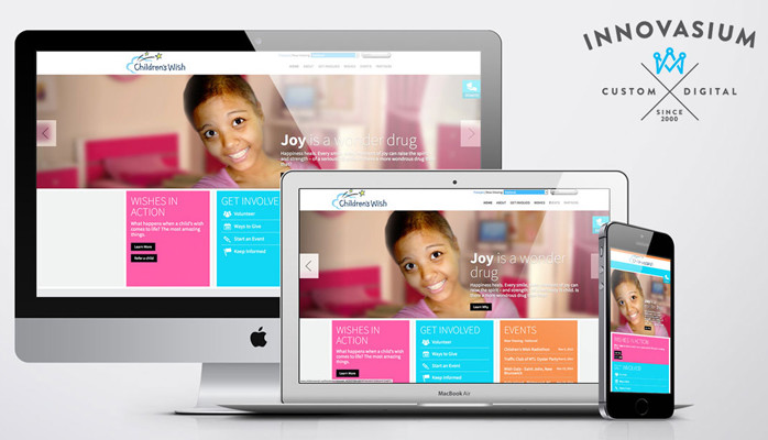
Responsive design is a solution for website incompatibility. It adapts the website’s layout and functionality to match the device’s screen size, orientation, and capabilities, ensuring a consistent and optimal experience across all platforms. A well-designed responsive site is optimized for different screen sizes, enhancing user engagement and ensuring easy access to all content.
Related Post : Corporate Website Not Generating Leads? Identifying Design Issues Affecting Conversions.
The Role of Responsive Web Design in Overcoming Incompatibility
Building a Mobile-First Approach
A mobile-first approach to web design prioritizes the mobile experience first. The aim is to start with the mobile design and then adapt for larger screens. With a focus on minimalism and user-friendliness, this approach prioritizes usability and accessibility from the beginning. This iterative process yields a mobile-friendly site ready for any screen size or device functionality.
Designing for Varying Screen Sizes
Responsive web design leverages fluid grids, flexible images, and media queries to make the website adaptable to various screen sizes, from the smallest smartphone to the largest desktop monitor. This dynamic adjustment to screen size ensures the website is visually appealing and usable regardless of the device being used to access it. Implementing adaptive design helps ensure the optimal user experience, irrespective of screen dimensions or devices.
Ensuring Usability Across Devices
Usability plays a significant role in responsive design. Simple navigation, clear calls to action, and easy-to-understand content are crucial elements of mobile-optimized designs. A mobile-friendly website prioritizes intuitive navigation, allowing users to effortlessly find the information they need, leading to a positive perception and increased user engagement.
Real-World Examples and Case Studies
Case Study: Company X
Company X saw a significant drop in mobile traffic after their website failed to adapt to different screen sizes. Their conversion rates plummeted, and user engagement decreased substantially. Implementing a responsive design approach, they were able to reverse this trend. They noticed a considerable increase in mobile conversion rates, user engagement, and a significant improvement in their brand perception.
Industry Trends and Statistics
Recent studies from leading market analysis firms highlight the growing importance of mobile-first design. A significant portion of online traffic now comes from mobile devices, emphasizing the crucial need for mobile-friendliness. Businesses ignoring this trend risk losing significant market share and hindering growth potential.
Practical Implementation Steps
Implementing responsive design requires a thorough understanding of user needs and preferences, consistent testing across various devices, and ongoing maintenance and optimization. This approach ensures users can access the site and interact with the intended services on any device.
Best Practices for Creating Mobile-Friendly Websites
Optimizing Images and Media
Optimizing images is crucial. Using compressed images, responsive images, and a clear understanding of how images are loaded and displayed reduces loading time and improves user experience.
Streamlining Navigation
Streamlining navigation ensures an effortless user experience. Intuitive navigation allows users to quickly find information on the website, thereby preventing frustrations and ensuring a seamless experience. Clear organization helps maintain engagement.
Prioritizing Content and Layout
Prioritizing content and layout is crucial in today’s online landscape. A clear understanding of how different devices load content is essential. The presentation of the website should be in line with user expectations and needs, resulting in a well-structured and user-friendly experience, resulting in a more seamless user experience.
Advanced Techniques for Responsive Design
Utilizing Mobile-First Development
Mobile-first development methodologies prioritize the mobile experience, focusing on a smaller screen first, then adapting for larger displays, thus reducing development complexity and issues, enhancing efficiency and ensuring a faster development process. This ensures a responsive experience on the device it was initially designed for.
Implementing Progressive Web Apps
Progressive Web Apps (PWAs) offer a hybrid mobile experience, combining the benefits of web apps and mobile apps. This creates a rich and immersive user experience on mobile devices, and offers a significant enhancement to the standard web experience.
Utilizing Testing Tools and Techniques
Utilizing testing tools and techniques across various devices and operating systems helps ensure the website adapts seamlessly to different screen sizes, form factors, and functionalities, guaranteeing consistent performance across a wide range of devices.
In conclusion, mobile incompatibility significantly impacts a company’s web presence and user experience. Prioritizing responsive web design is crucial for ensuring a seamless experience across all devices. Implementing a responsive design approach isn’t just a trend; it’s a necessity in today’s multi-device world. By following the steps outlined in this article, businesses can take proactive measures to avoid the pitfalls of mobile incompatibility and cultivate a positive user experience, driving growth and engagement on their corporate website. Now, take the next step to ensure your website is ready for the mobile-first future, by evaluating your current design, making necessary adjustments, and fostering positive user feedback.